
Niagara Neutrals: Colour Palettes Inspired by Waterfalls, Wineries, and Escarpments
- Thomas De Simone
- Sep 9, 2025
- 3 min read


When choosing colours for your home, inspiration is often found in the world around us. In Niagara, that inspiration is especially rich—cascading waterfalls, rolling vineyards, and the rugged escarpment all offer natural palettes that are both timeless and sophisticated. By drawing from these regional elements, you can design interiors that feel grounded in place while offering a fresh, modern appeal.
Let’s explore how Niagara’s landscapes inspire neutral palettes—stone greys, wine reds, misty whites, and forest greens—and how these colours can be used to transform your home.
The Power of Neutrals
Neutral palettes are more than just shades of beige. They serve as the foundation of great design, creating spaces that are calming, versatile, and elegant. What makes neutrals powerful is their adaptability: they can stand alone for a minimalist look or serve as a backdrop for bold accents.
In Niagara, where natural scenery is such an important part of daily life, neutrals that reflect the region’s character help blur the line between indoors and outdoors.
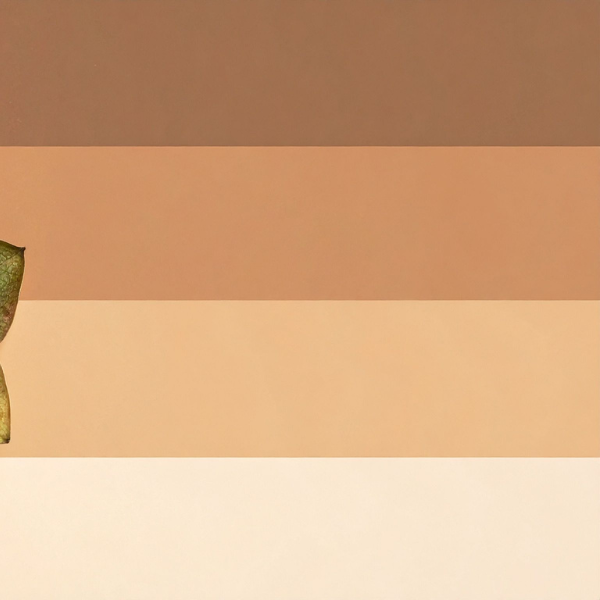
Stone Greys: Inspired by the Escarpment

The Niagara Escarpment, with its rugged cliffs and rocky formations, inspires a palette of stone greys ranging from soft dove tones to deep charcoals. These hues work beautifully in:
Living Rooms: Grey walls paired with warm wood accents create balance and warmth.
Bathrooms: Slate tiles bring a spa-like quality reminiscent of natural stone.
Exteriors: Charcoal siding or trim echoes the strength and durability of the escarpment itself.
Pairing stone greys with warm neutrals like taupe or cream ensures that interiors feel inviting rather than cold.
Wine Reds: Drawn from Niagara’s Vineyards

Few regions in Canada boast such renowned wineries, and Niagara’s rolling vineyards provide more than just world-class wine—they also inspire stunning colour schemes. Rich burgundy, muted merlot, and soft rosé tones all carry elegance and depth.
Dining Rooms: Accent walls in deep wine shades create intimate, luxurious settings.
Kitchens: Rosé-inspired backsplashes add warmth and personality without overwhelming.
Accents: Throw pillows, area rugs, or upholstered chairs in wine tones add richness to neutral backdrops.
Wine reds pair beautifully with misty whites or forest greens, evoking the full vineyard experience.
Misty Whites: Reflecting Niagara’s Waterfalls
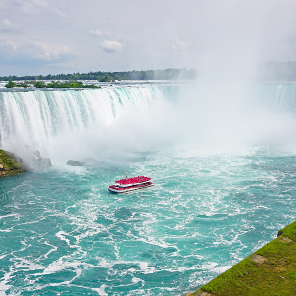
Niagara Falls is not just a natural wonder—it’s also a muse for design. The mist and spray inspire soft whites and silvery undertones that feel both clean and dynamic.
Bedrooms: Misty white walls create serene, restful retreats.
Open-Concept Spaces: White with subtle grey undertones enhances brightness and continuity.
Cabinetry & Trim: Crisp whites highlight architectural details while keeping the overall look fresh.
Misty whites reflect natural light beautifully, an important factor in Niagara homes that need to stay bright through winter months.
Forest Greens: Rooted in Niagara’s Woodlands

The Niagara region is rich in parks, trails, and wooded landscapes, making forest greens a natural addition to the palette. From deep evergreens to softer sage, these hues bring the outdoors inside.
Kitchens: Green cabinetry is a trend that balances modern flair with earthy calm.
Living Rooms: Accent walls or velvet sofas in deep green add drama and comfort.
Bathrooms: Sage tiles create a spa-like sanctuary with a hint of nature.
Greens work especially well with stone greys and misty whites, grounding spaces while keeping them vibrant.
Balancing the Palette
The key to designing with Niagara neutrals is balance. While stone greys and misty whites provide a strong foundation, wine reds and forest greens act as accents that bring personality and warmth. A well-designed room might use whites and greys on the walls, with green cabinetry and red accessories tying everything together.
Texture is also essential. Layering different finishes—matte walls, glossy tiles, rough stone, and soft fabrics—ensures the palette feels dynamic rather than flat.
Niagara-Specific Applications
Condos in St. Catharines: Misty whites and soft greys maximize natural light in smaller spaces.
Townhomes in Niagara Falls: Forest greens paired with wine-inspired accents create cozy, stylish interiors.
Heritage Homes in Niagara-on-the-Lake: Deep reds and greys complement historic architecture while keeping interiors timeless.
Rural Retreats: Earthy palettes with natural wood textures echo the escarpment and vineyards just outside your door.
Final Thoughts
Niagara’s natural beauty offers endless inspiration for interior design. By pulling from the escarpment’s stone greys, the vineyards’ wine reds, the falls’ misty whites, and the forests’ deep greens, homeowners can create interiors that feel both modern and deeply connected to place.
Whether you’re renovating a townhome, styling a condo, or refreshing a heritage property, Niagara neutrals provide a palette that balances elegance, versatility, and a sense of homegrown identity.
Ready to explore a colour palette rooted in Niagara’s landscapes? De Simone Design can help craft a look that feels both timeless and locally inspired.


Comments